Users have the option to customise elements of a graph's look and feel through the Advanced settings field. This can perform several tasks:
- Change the graph and axis titles
- Change the font size, colour, and style
- Modify the legend position and style
Please note that a number of advanced graph customisations are not currently available with ChartJS.
As of Totara 13, the advanced settings field for Totara graphical reports is written in JSON format to specify custom settings that will work across all charting libraries. If you had specified INI settings in Totara 12 or below, a compatible version of your settings should already be present.
These settings are not specific to a charting library and will work when using both ChartJS and SVGGraph graphs.
Title settings
Setting | Description |
|---|---|
| text | The title text to show on the graph. Example: "Course Completion Report" |
| position | Where on the graph to display the title. Allowed values: "top", "left", "bottom", "right" |
| font | Font to use for the title. Only works if the user has the font installed. Example: "Times New Roman" |
| fontSize | Size of the text in the title in pixels. Example: 16 |
| fontStyle | Text style to apply to the title Example: "bold" |
| color | Colour for title text in hexadecimal or rgb Example: "#f0f0f0" |
| padding | Amount of space around the title text in pixels Example: 5 |
Example
{
	"title": "Example Graph Title"
}

OR

{
	"title": {
		"text": "Example Graph Title",
		"position": "top",
		"font": "Times New Roman",
		"fontSize": 16,
		"fontStyle": "bold",
		"color": "#fff",
		"padding": 5
	}
}
Legend settings
Setting | Description |
|---|---|
| display | Whether to show the legend. Example: true |
| position | Where on the graph to display the legend. Allowed values: "top", "left", "bottom", "right" |
| font | Font to use for the legend items. Only works if the user has the font installed. Example: "Times New Roman" |
| fontSize | Size of the text in the legend in pixels. Example: 16 |
| fontStyle | Text style to apply to the legend. Example: "bold" |
| color | Colour for legend text in hexadecimal or RGB. Example: "#f0f0f0" |
| padding | Amount of space around the legend text in pixels. Example: 5 |
Example
{
	"legend": {
		"display": true,
		"position": "left",
		"font": "Times New Roman",
		"fontSize": 16,
		"fontStyle": "bold",
		"color": "fff",
		"padding": 5
	}
}
Tooltip settings
Setting | Description |
|---|---|
| display | Whether to show tooltips. Example: true |
| backgroundColor | The colour to set the tooltip background. Example: "#dad4da" |
| font | Font to use in tooltips. Only works if the user has the font installed. Example: "Times New Roman" |
| fontSize | Size of the text in the tooltip in pixels. Example: 16 |
| fontStyle | Text style to apply to the tooltip. Example: "bold" |
| color | Colour for tooltip text in hexadecimal or RGB. Example: "#f0f0f0" |
| borderRadius | The roundness of the edges of the tooltip (in pixels). Example: 2 |
| borderColor | The colour of the tooltip border. Example: "#0a7b92" |
| borderWidth | The thickness of the tooltip border (in pixels). Example: 2 |
Example
{
	"tooltips": {
		"display": true,
		"backgroundColor": "#ddd",
		"font": "Times New Roman",
		"fontSize": 16,
		"fontStyle": "bold",
		"color": "#fff",
		"borderRadius": 5,
		"borderColor": "#0a7b92",
		"borderWidth": 3
	}
}
Axis settings
Axis settings need to be applied to either the "x" or "y" axis. The settings between each axis are identical.
Setting | Description | Notes |
|---|---|---|
| display | Whether to show the line for this axis. Example: true | - |
| title | Axis label for the graph. These use the same settings as the Graph Title. | - |
| grid | Settings to control the axis grid. | - |
| grid → display | Whether to show the lines for the axis grid. Example: true | - |
| grid → color | Colour of the axis grid lines. Example: "#0ff000" | - |
| max | This is the maximum value of either axis. This value will depend on the values used on your axis, so it could be numerical or alphanumerical, e.g. if the x axis contained a list of months you could set the max to 'April' so that it would not show content past this value, if you wanted to restrict it to the current financial year for example. | If you are using a text value as your maximum this must be a value with data associated to it. For example, if one of your axes is labelled with days of the week and your data includes the values Monday, Tuesday, Thursday, Friday and Saturday, then you would not be able to use the setting "max":"Wednesday". This is because there is no Wednesday data in the graph. A numerical value doesn't have this same issue. |
Example
{
	"axis": {
		"x": {
			"display": true,
			"max": "April",
			"title": {
				"text": "Horizontal Axis Label",
				"font": "Times New Roman",
				"fontSize": 22,
				"fontStyle": "bold",
				"color": "#fff000",
				"padding": 10
			},
			"grid": {
				"display": true,
				"color": "#fff000"
			}
		},

		"y": {
			"display": true,
			"title": {
				"text": "Vertical Axis Label",
				"font": "Times New Roman",
				"fontSize": 22,
				"fontStyle": "bold",
				"color": "#f0f0ff",
				"padding": 10
			},
			"grid": {
				"display": true,
				"color": "#3a4f3a"
			}
		}
	}
}
Graph colour settings
As of Totara 13.2 it is possible to specify graph colours using both ChartJS and SVGGraph.
Setting | Description |
|---|---|
| colors | Colours used for the main content of a graph (e.g. different bars on a bar chart). See examples below. |
Examples
The default colours used for graph contents are shown here:
{"colors" : [
"#3869B1",
"#DA7E31",
"#3F9852",
"#CC2428",
"#958C3D",
"#6B4C9A",
"#8C8C8C"
]}
You can outline as many colours as you require in the following way:
{"colors": ["#ff0000", "#00ff00", "#0000ff"]}
Progress donut settings
Setting | Description |
|---|---|
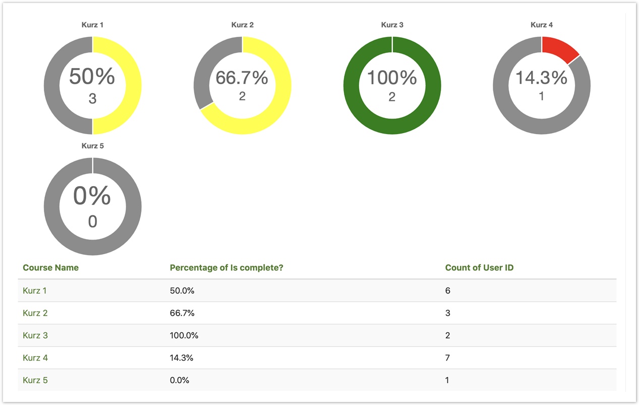
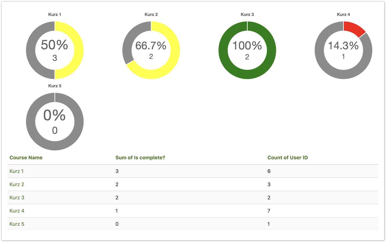
| totalsSupplied | Enable if the second column contains totals. |
| percentageValues | Enable if the first column contains percentages instead of count. |
| colorRanges | This setting allows for assigning colours to value ranges. Define an array of percentage values as boundaries for the next colour in the colour set. |
| backgroundColour | Set the colour of the 'empty' part of the pie chart (i.e. total minus progress value). |
Example 1
{
"colors" : ["red", "yellow", "green"],
"colorRanges": [20, 100],
"type" : {
  "progress": {
    "totalsSupplied": true,
    "percentageValues": true
  }
}
}
Example 2
{
"colors" : ["red", "yellow", "green"],
"colorRanges": [20, 100],
"type" : {
  "progress": {
    "totalsSupplied": true,
    "percentageValues": false
  }
}
}
Example 3
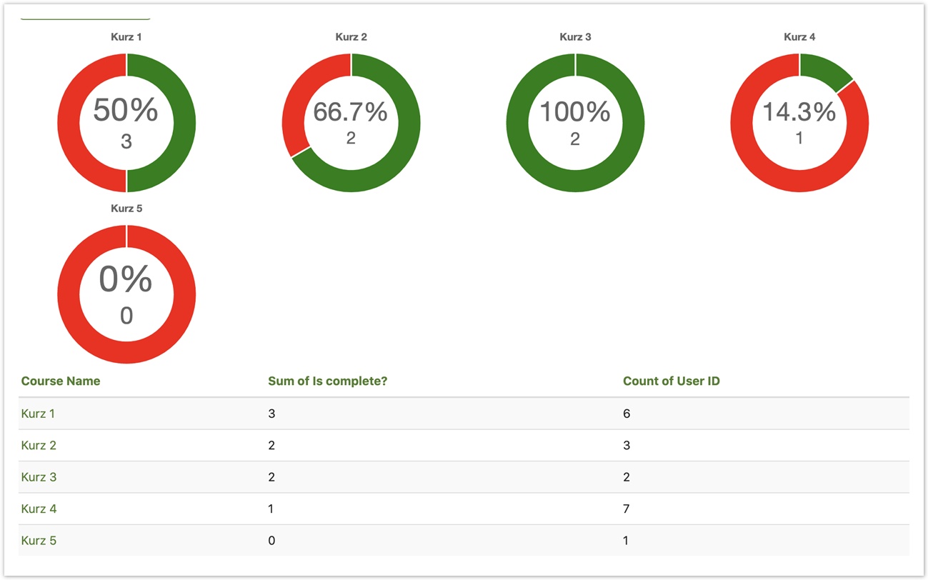
{"colors" : ["green"],
"type" : {
  "progress": {
    "totalsSupplied": true,
    "backgroundColor": "red"
  }
}
}
Dataset settings
Setting | Description |
|---|---|
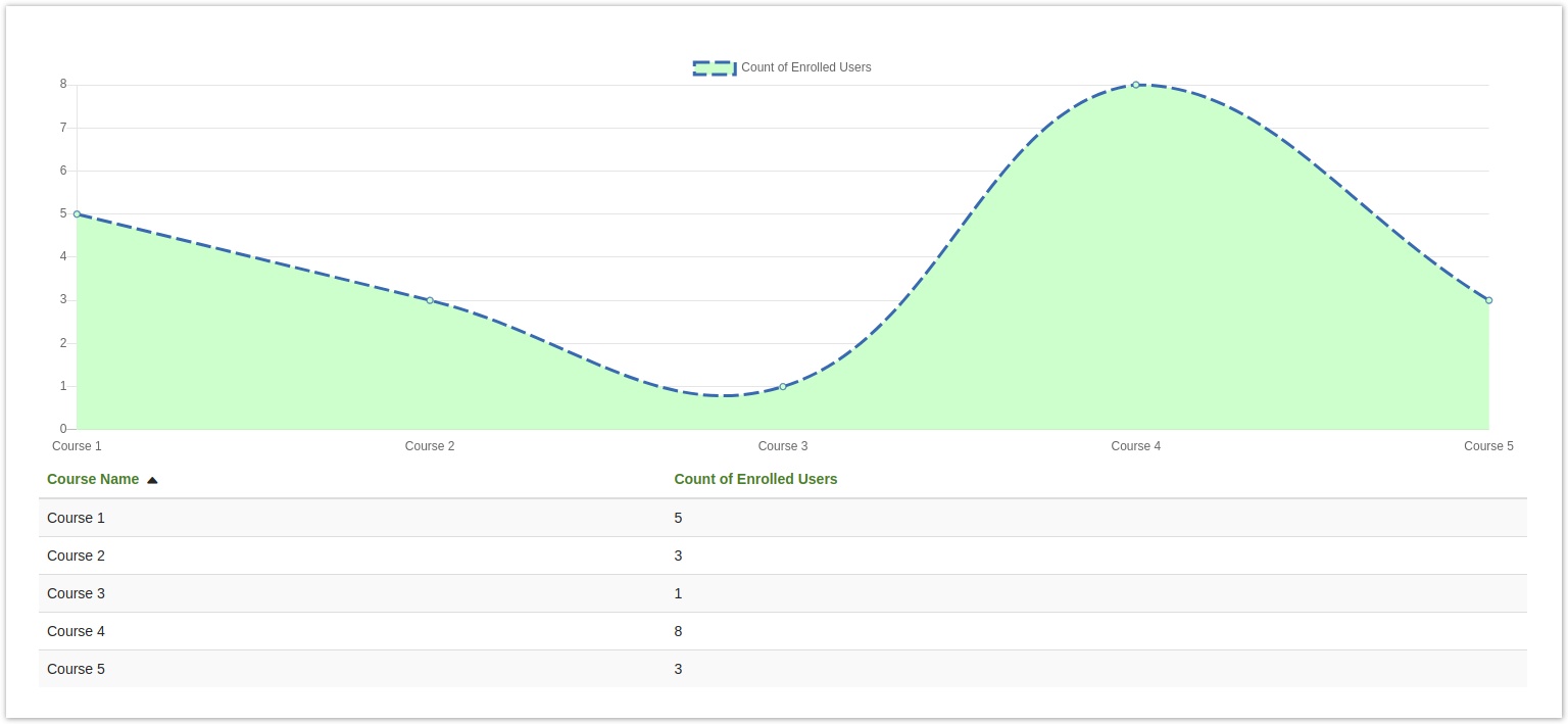
| fill | Determines whether or not the element is filled, such as the area under the line on an area chart. Example: true |
| borderDash | The dash style for the stroke of an element. The two numbers provided control the length of each dash and the length of each gap. Example: [15, 5] |
| borderColor | The stroke colour of the data element (e.g. point, line, bar). Example: #CCFFCC |
| borderWidth | The stroke width for the element. Example: 3 |
| backgroundColor | The fill colour of the data element (e.g. point, line, bar). Example: #CCFFCC |
| pointStyle | The appearance of each point on a graph. Example: circle |
The settings listed above are just a selection of useful settings
You can find the full list of settings in the ChartJS documentation.
Note that these settings are only available in the ChartJS library, not SVG Graph.
Example
{
    "data-settings": {
         "0": {
             "fill": true,
             "borderDash":[15,5],
             "backgroundColor": "#CCFFCC"
          }
     }
}
Library-specific settings
If you want to write more advanced settings to take advantage of some of the extended capabilities of your charting library, you may use the "custom" settings field to pass settings directly to the library. These will not be cross-compatible.
Official documentation for SVGGraph
Official documentation for ChartJS
SVGGraph Example
{
	"custom": {
		"legend_columns": 3,
		"legend_title_font_weight": "italic",
		"legend_draggable": false
	}
}
ChartJS Example
{
	"custom": {
		"axis": {
			"scales": {
				"yAxes": [{
					"gridLines": {
						"display": false
					}
				}]
			}
		}
	}
}
Full example
{
	"title": {
		"text": "Graph Title",
		"position": "top",
		"font": "Times New Roman",
		"fontSize": 22,
		"fontStyle": "bold",
		"color": "#ea22a9",
		"padding": 10
	},

	"legend": {
		"display": "true",
		"position": "top",
		"font": "Times New Roman",
		"fontSize": 16,
		"fontStyle": "italic",
		"color": "#ee22a9",
		"padding": 5
	},

	"tooltips": {
		"display": true,
		"backgroundColor": "#eaeaea",
		"font": "Times New Roman",
		"fontSize": 16,
		"fontStyle": "bold",
		"color": "#1f1f1f",
		"borderRadius": 5,
		"borderColor": "#ee22a9",
		"borderWidth": 1
	},

	"axis": {
		"x": {
			"display": false,
			"title": {
				"text": "Horizontal Axis",
				"font": "Times New Roman",
				"fontSize": 16,
				"fontStyle": "italic",
				"color": "#ea22a9",
				"padding": 10
				"max": "April",
			},
			"grid": {
				"display": true,
				"color": "#eaeaea"
			}
		},

		"y": {
			"display": false,
			"title": {
				"text": "Vertical Axis",
				"font": "Times New Roman",
				"fontSize": 16,
				"fontStyle": "italic",
				"color": "#ea22a9",
				"padding": 10
			},
			"grid": {
				"display": true,
				"color": "#eaeaea"
			}
		}
	}
}


