Mobile design guidelines
Introduction
This document covers the visual styles and interaction patterns used in the Totara Mobile app. It is intended for developers and designers working on expanding and customising the app, to help them create a cohesive and enjoyable experience for their users.
It is a living document and will be updated as the app evolves. Please refer to the latest version when designing and implementing new features and workflows.
Fundamentals
We used React Native to build the Totara Mobile app for both iOS and Android platforms. The app is published for both platforms, with consideration for the different approaches they take on UX.
To learn more about the design principles and native controls (e.g. switches, status bars, etc.) used in the app, please refer to the iOS and Android design guidelines:
- Read more about iOS human interface guidelines (Apple)
- Read more about Android design guidelines (Google)
- Read more about the Totara Mobile app theme: Theming product documentation
Colour
Colour theme is applied consistently across all the app, with the default theme based on the Totara brand.
Colour variables, as depicted below, follow an abstract semantic framework that is applied in a meaningful manner consistently throughout the app. This enables users to derive meaning via colour, aiding the user experience. Each colour variable is customisable to match the customer's brand and design needs.
Brand
| |||||||||
| PRIMARY #69BD45 105, 189, 69 | ||||||||
Neutral
| |||||||||
| NEUTRAL-01 |
| NEUTRAL-02 #F5F5F5 245, 245, 245 |
| NEUTRAL-03 #E6E6E6 230, 230, 230 |
| NEUTRAL-04 #D2D2D2 210, 210, 210 | ||
| NEUTRAL-05 #C7C7C7 199, 199, 199 |
| NEUTRAL-06 #7D7D7D 125, 125, 125 |
| NEUTRAL-07 #4A4A4A 74, 74, 74 |
| NEUTRAL-08 #000000 0, 0, 0 | ||
Prompt
| |||||||||
| INFO #337Ab7 51, 122, 183 |
| SUCCESS #69BD45 105, 189, 69 |
| WARNING #8E660D 142, 102, 13 |
| ALERT #953539 149, 53, 57 |
| HIGHLIGHT #FDF8E4 253, 248, 228 |
Interact
| |||||||||
| LINK #007AFF 0, 122, 255 |
| DESTRUCTIVE #FF3B30 255, 59, 48 | ||||||


Layout, grid and spacing
The Totara Mobile app uses the widely popular 8pt grid for consistency and flexibility. Layouts, margins and UI element dimension are multiples of 8: 4, 16, 24, 32, 40, 48. This helps us achieve visual harmony and optimal rendering on most common screen sizes and device pixel density (for example x0.75, x1, x1.5, x2, x3). Follow this grid when designing and implementing new layouts in order to maintain a consistent UI.
- Responsiveness: We use flexible UI components with fixed spacing, based on 8pt grid, to ensure a good fit on any mobile device (and to future-proof the app)
- Readability: All pages follow Apple's safe area guideline, with margins on all edges, clear of content and interactive elements (excluding content overflow which users can swipe to scroll through)
- Harmony: Grouping and stacking elements based on 8pt grid (this is true for cards, tiles and page layouts)
- Usability: Touchscreen interaction must be forgiving to user errors, allowing for multiple factors such as 'fat fingers' and on-the-go usage - interactive elements such as buttons need bigger target areas (at least 40px) and generous spacing around them
- Read more about the 8pt grid: The comprehensive 8pt grid guide (Medium)
Typography
Typography, according to Wikipedia, is "the art and technique of arranging type to make written language legible, readable and appealing when displayed". In essence, mobile typography helps users find their way around the app with ease. We use fonts, text sizes, colour, grouping and spacing to bring order and hierarchy, making the app more user friendly and accessible.
Text styles
Totara mobile app uses iOS & Android system fonts:
| Style | iOS Font | Android font | Weight | Size (px) | Letter space (px) | Line height (px) |
|---|---|---|---|---|---|---|
| H1 | SF Pro Display | Roboto | Bold | 40 | 0.36 | 48 |
| H2 | SF Pro Display | Roboto | Bold | 34 | 0.18 | 41 |
| H3 | SF Pro Display | Roboto | Bold | 28 | 0 | 34 |
| H4 | SF Pro Display | Roboto | Bold | 22 | 0 | 28 |
| Subtitle | SF Pro Display | Roboto | Medium | 20 | 0 | 25 |
| Body | SF Pro Text | Roboto | Regular | 17 | -0.4 | 22 |
| Body bold | SF Pro Text | Roboto | Bold | 17 | -0.2 | 22 |
| Callout | SF Pro Text | Roboto | Regular | 16 | -0.32 | 21 |
| Small | SF Pro Text | Roboto | Regular | 15 | -0.24 | 20 |
| xSmall | SF Pro Text | Roboto | Regular | 13 | 0 | 18 |
| xxSmall | SF Pro Text | Roboto | Regular | 11 | 0.2 | 13 |
| Button label | SF Pro Text | Roboto | Medium | 17 | -0.2 | 22 |
Imagery
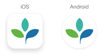
App icon
The app icon appears on phone home screens, in menus and on the app stores. A well designed icon helps users recognise the app at a glance. See below all the different sizes used to show the app icons on different platforms. Providing all these sizes will ensure your icon always looks at its best.
This is the default app icon. The clean and minimalistic design uses Totara's brand logo and colours, and the white background makes it stand out in busy home screens, menus and lists. You can change the default app icon and rename your app in any mobile development tools such as React Native.
- Read more about App icon guidelines (Apple)
- Read more about Product icons (Google)
- Read more about changing app icons in React Native (aboutreact.com)
- Read more about the Totara Mobile app icon: Theming product documentation
iPhone icon size (px)
| Pixel density | Notifications | Settings | Spotlight | App icon |
|---|---|---|---|---|
1x 2x 3x | 20 x 20 40 x 40 60 x 60 | 29 x 29 58 x 58 87 x 87 | 40 x 40 80 x 80 120 x 120 | 60 x 60 120 x 120 180 x 180 |
iPad icon size (px)
| Pixel density | Notifications | Settings | Spotlight | App icon | App icon (12.9 inch) |
|---|---|---|---|---|---|
1x 2x | 20 x 20 40 x 40 | 29 x 29 58 x 58 | 40 x 40 80 x 80 | 76 x 76 152 x 152 | 83.5 x 83.5 167 x 167 |
| App store | Splash screen | Site URL and About screen | |||
1x 2x 3x | 1024 | 180 x 180 360 x 360 540 x 540 | 120 x 85 240 x 170 360 x 255 | ||
Android icon size (dp)
| Screen resolution | Launcher icons | Action bar, dialog and tab icons | Small contextual icons | Notification icons |
|---|---|---|---|---|
mdpi hdpi xhdpi xxhdpi xxxhdpi | 48 x 48 72 x 72 96 x 96 144 x 144 192 x 192 | 24 x 24 36 x 36 48 x 48 72 x 72 96 x 96 | 16 x 16 24 x 24 32 x 32 48 x 48 64 x 64 | 22 x 22 33 x 33 44 x 44 66 x 66 88 x 88 |
App logo and splash screen
The splash screen appears while the app loads in the background. Totara's default splash screen shows the Totara logo over a white backdrop. Once loaded, the app redirects to the homepage. On first-time use, or if the user is logged out or when the server URL has changed, it redirects to the Get started screen (see below screenshot), where the user is asked to enter their organisation's URL. You can customise the splash screen by changing the logo image.
- Optimal image dimensions: 120 x 85px
- Supported file formats: PNG / JPG / GIF
 and Get started screen (right).")
Icons
We use icons for common actions, status and feedback. When used correctly they help declutter the UI and reduce users' cognitive load. The Totara Mobile app makes use of the Font Awesome open source icon set, with a few custom icons of our own making.
All these icons are designed to be simple, modern, friendly, and a bit quirky. Each icon is reduced to its minimal form, expressing essential characteristics. We recommend following these principles if you wish to add your own custom icons.
Font Awesome icons
|
|
|
|
|
|
| Settings | f013 | Delete | f2ed | Sync | f021 | Complete | f058 | External link | f35d | Failed | f057 |
| | | | | |
| Error | f071 | Ban | f05e | Chevron-down | f078 | Chevron-up | f077 | Info | f129 | Lock | f023 |
Custom icons - tab bar
|
|
|
|
|
|
| Home | Find learning | Current learning | Downloads | Notifications | User profile |
Custom icons - downloads
|
|
|
| Ready for download | Downloading | Downloaded |
Custom icons - activity status
|
|
|
|
|
| Self-completion | Automatic completion | Complete | Failed | Locked |
Icon sizes
| iOS Pixel density | Android | Icon size (px) |
|---|---|---|
1x 2x 3x | mdpi xhdpi xxhdpi | 24 x 24 48 x 48 72 x 72 |
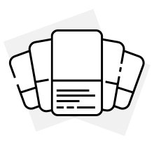
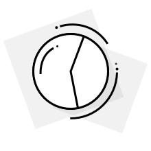
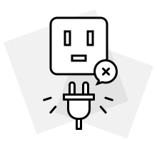
Default illustrations
We created these illustrations to provide feedback in an engaging and visual way. Illustrations make the app more delightful for users, but they should be accompanied by other forms of feedback (such as text) in order to ensure clarity and accessibility.
This default collection is included with the app. You can replace them with your own images.
- Image files: https://git.totaralearning.com/projects/MOB/repos/totara-mobile-app/browse/src/resources
- Optimal image dimensions: 200 x 200px
- Supported file formats: PNG / JPG / GIF
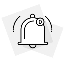
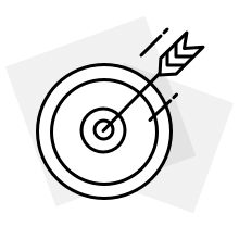
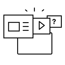
Current learning empty state | Additional action required | Course not compatible | Notifications empty state |
|
|
|
|
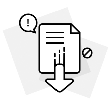
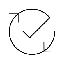
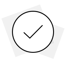
Download empty state | URL not compatible | Authentication in browser | Mark as complete |
|
|
|
|
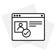
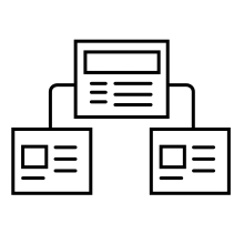
Successfully completed | Default course image | Default certification image | Default program image |
|
|
|
|
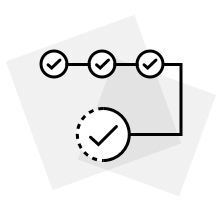
Attempt complete | |||
|

Navigation and information architecture
The app's information architecture is fairly simple:
- Once logged in you arrive on the homepage, which displays Current learning (courses, programs and certifications you are enrolled in)
- Other top-level pages include Find learning (available only in Totara 15 onwards), Downloads (a list of downloaded SCORM packages which can be accessed offline), Notifications and User profile

Navigation bar
Use the navigation tab bar to navigate between top-level pages. Depending on the version of Totara you're using, there are four (in Totara 13-14) or five (if you use Totara 15) top-level pages. Find learning is available only in Totara 15 onwards.
If you plan to add more top-level pages be mindful that the tab bar should hold no more than five items, so consider removing existing items in order to maintain the five-item limit.
 and Totara 15 tab bar with five items (right).")